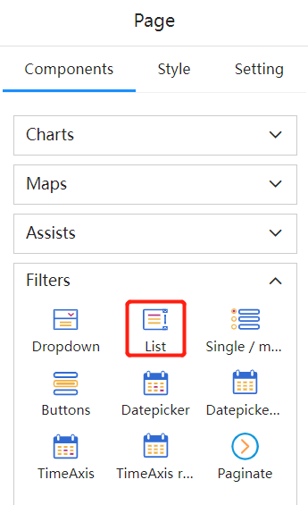
List Box
List box is used to provide a set of items (data items) from which the user can select one or more items using a mouse. However, the user cannot directly edit the data in the list box.

Setting Data
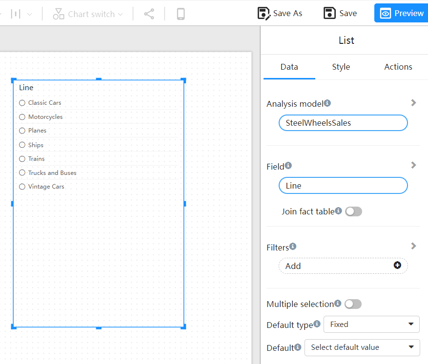
A list box can display a field from a dimension or hierarchy.

Associated Fact Table: Associates the dimension table with the real-time table. When this switch is enabled, if there are no dimension-related records in the real-time table, the dimension data will not appear in the list box. In addition, the component filtering is also affected by the "Associated Real-time Table" switch. When this switch is turned on, any dimension in the model or field on the fact table can be used to filter the list box field.
Multiple Selection: Allows multiple selection of items in the list box.
Default Value Type: Fixed default value and relative default value. The fixed default value is to select one or more fixed items from the list as the default selection. Relative default value: first item, last item.
Setting Behaviors

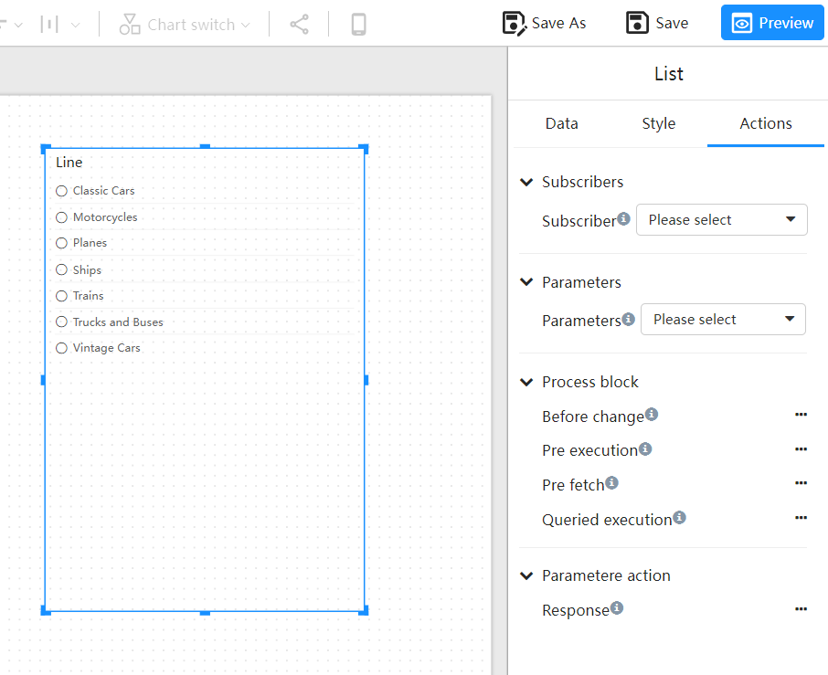
Subscribers: Establish a "filter" relationship between the list box component and other components on the page. The selected value in this list box will be the "filter" subscribed by the affected components.
Parameters: Assign the selected value in the list to the relevant parameter.
Custom Process: Embed JavaScript code to execute during different rendering stages of the component.
For example, when we need to adjust the rendering effects of a component, we can intervene in this custom process "before execution."
function shouldExecute(require, options){
    options.value = options.value?.slice(0, 3) || [];
    return true;
}
This logic will cause the list component to always display only the first 3 items of the list data.